

Branding · Web & Digital
Black Arrow Rebranding
Black Arrow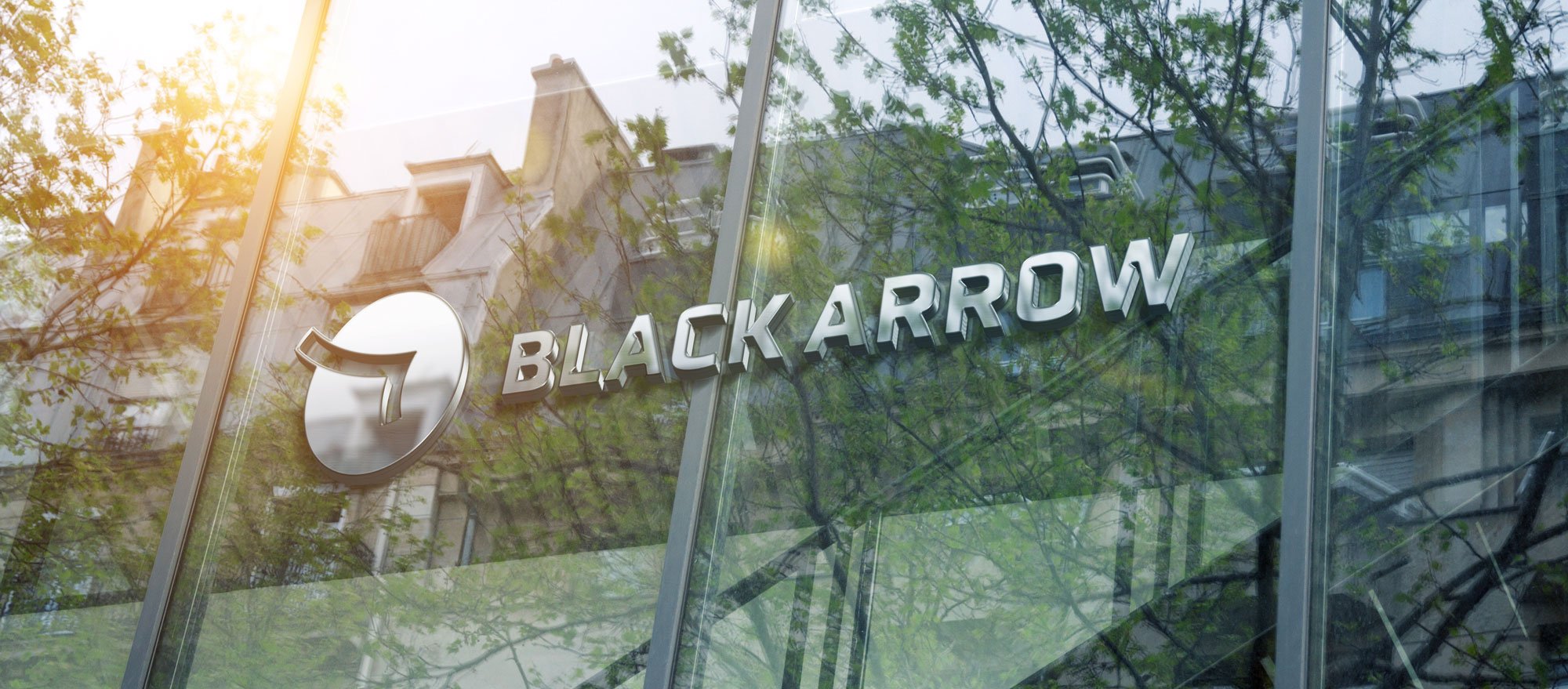
Migrating to the future
Black Arrow delivers tailored solutions for digital transformation, smart city initiatives, security systems, AV technology, and lighting services across Qatar and the Kingdom of Saudi Arabia. Everythink Design Studio partnered with them on an end-to-end engagement — branding, website, and social media — to build one cohesive digital and brand experience.
The Challenge
Black Arrow operates at the frontier of smart cities and technology, yet its existing identity didn't reflect that ambition. The brand needed a complete rethink: a logo that could stand alongside the region's most forward-looking companies, a visual system that worked consistently across every touchpoint, and a website capable of showcasing complex projects and services in a clear, engaging way. The challenge was to express innovation, quality, and customer service — the values Black Arrow is built on — through a single, unified brand experience spanning digital and print.
What We Did
We rebuilt the brand from the mark outward.
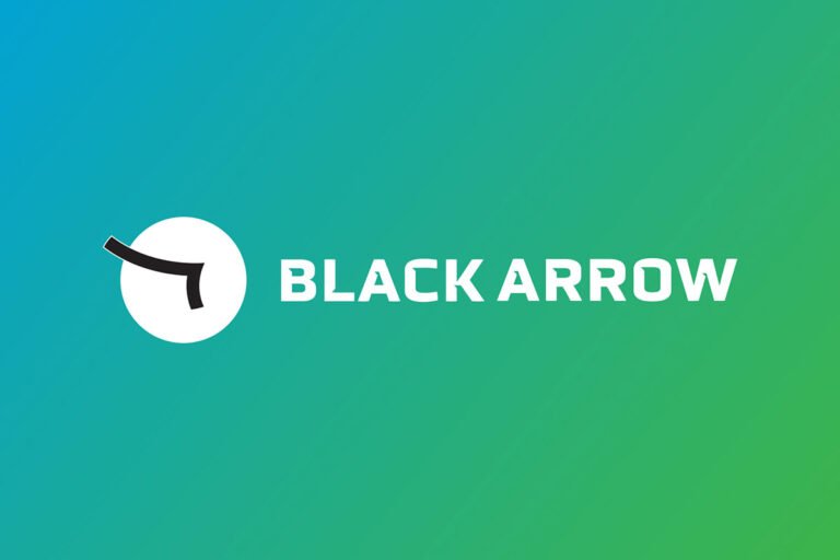

The logo reimagines the arrow as a flock of migratory birds flying over the horizon — a symbol of direction, momentum, and journeys that cross borders, just as Black Arrow's work spans Qatar and Saudi Arabia. The result is modern and sophisticated, a clear evolution from the original mark (shown below, old and new). The tagline — Migrating to the Future — gives the mark its voice. Born directly from the logo's migratory-bird concept, it captures in three words what Black Arrow does: moving businesses and cities forward, together.
The palette grounds the identity in a deep black, energized by two signature tones — BA Blue and BA Green — brought together in a 145° gradient that gives the brand its distinctive sense of motion and technology.
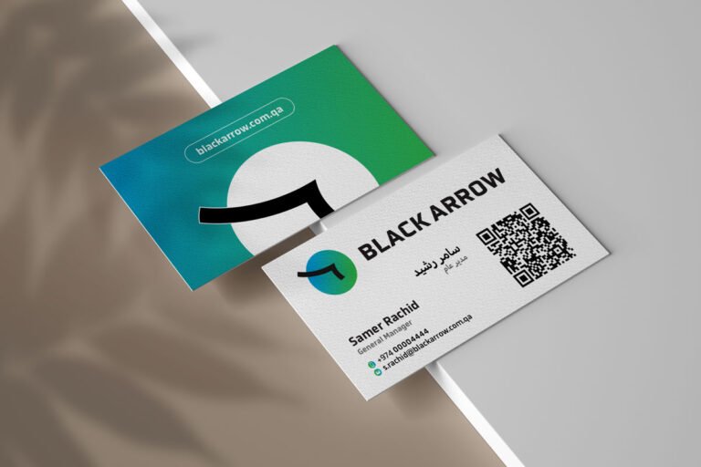

Custom typography was designed to complete the system, giving Black Arrow a voice that is entirely its own across the website, social media, and marketing materials. The website was designed to be user-friendly and informative, with projects and services front and center — fully responsive, so the experience holds on any device.
Outcome
Black Arrow now moves through the market with one unified identity — from logo and tagline to gradient, typeface, and website. Migrating to the Future is more than a line; it's the brand's entire idea distilled: birds in formation, an arrow in flight, a company leading the region's transformation. With a cohesive presence across digital, social, and print, Black Arrow is positioned as a serious player in smart city solutions, with a brand that travels as far as its ambitions.