
Branding · Web & Digital
Division 50 (formerly ANAT)
Division 50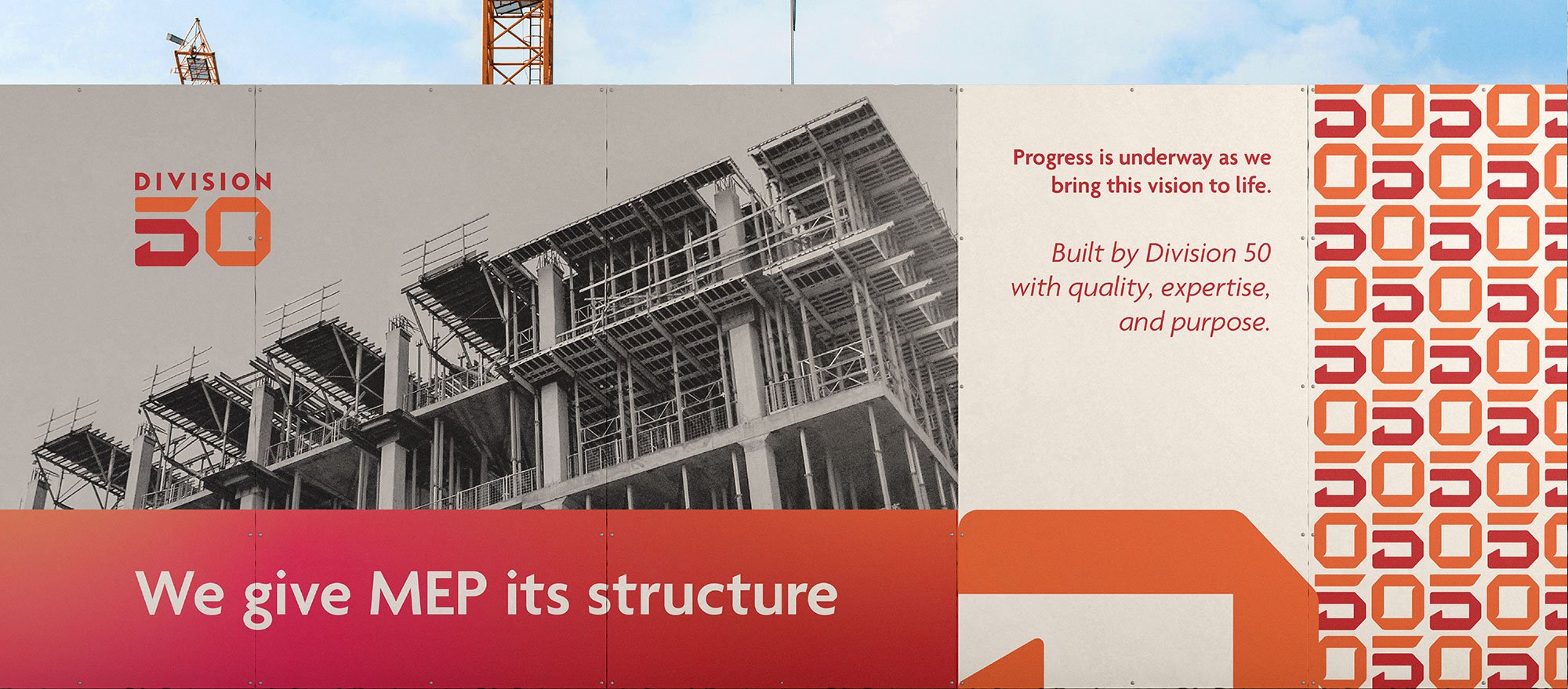
We Give MEP its Structure. A brand built on the language of construction.
Division 50 is a Riyadh-based electro-mechanical contractor with roots going back to 1994, when it began as ANAT. Over three decades, alongside its sister company Black Arrow, it has delivered more than 660 projects worth over SAR 5.5 billion. That work spans stadiums, airports, hotels, hospitals, royal palaces and giga-projects such as NEOM's Sindalah Island.
The Challenge
ANAT had the track record, but not the brand to match it. The name said little about what the company does. Its materials looked like those of every other contractor in the market. And as Saudi Arabia's Vision 2030 pipeline grew, the company was competing for larger, more prestigious projects. Consultants and main contractors there judge a partner in seconds, often on the strength of a single document.
The company was ready for a new name and a new identity. Our challenge was to create a brand that engineers would instantly understand and respect. It had to be precise, confident and built to last, and it had to carry 30 years of experience into a new chapter without losing any of it.
What We Did
We started with the way the construction industry itself is organised.
Every major building project in the world is specified using MasterFormat, the standard published by the Construction Specifications Institute. Since 2004 it has divided all construction work into 50 divisions, numbered 00 to 49, from concrete and metals to earthwork and utilities. At the heart of that system sit the building services: fire suppression, plumbing, HVAC, integrated automation, electrical, communications, and electronic safety and security, Divisions 21 to 28. That is exactly where the company works.
The name Division 50 comes from this system. It tells every engineer, consultant and client that the company speaks the full language of a project, not just its own trade. It also suggests a step beyond the standard: a partner who sees how every division connects and brings them together.
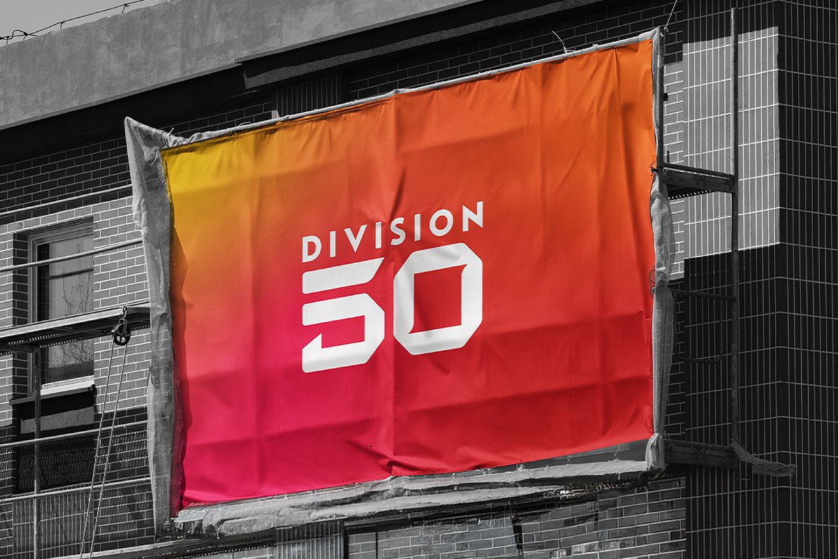
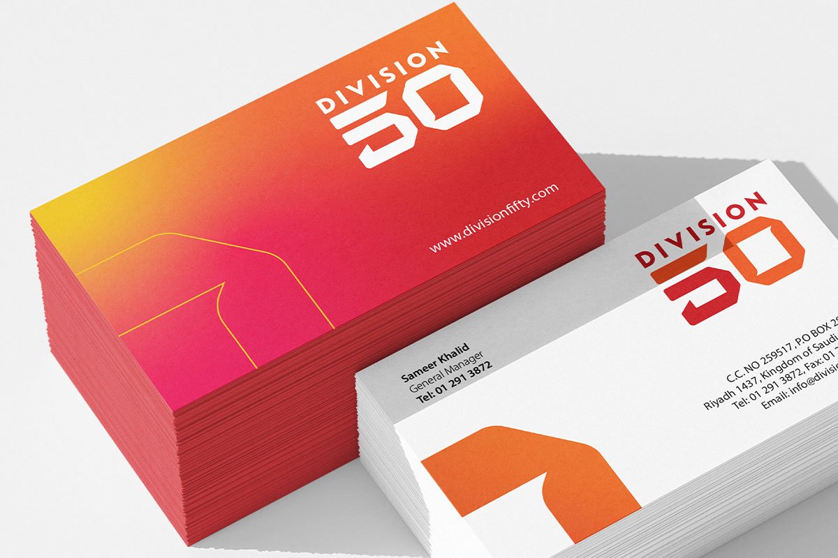
The logo is pure typography, strong and uncompromising. "Division" and "50" are shaped with distinctive angles and structural cuts, so each letter reads like a component fitted into place. The mark does what the company does: it brings separate parts together into one solid, engineered whole. It holds its own on a site hoarding as confidently as on a tender document.
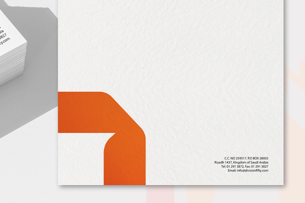
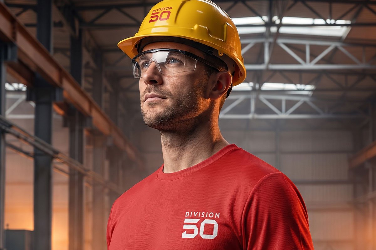
This idea shaped the tagline, We Give MEP its Structure. It carries through the whole identity system: colour palette, typography, grid. We then rolled the brand out across every touchpoint, including stationery, business cards, company profile, prequalification document, signage, vehicle livery, site hoardings, uniforms, PPE, presentation templates and digital assets.
Outcome
Division 50 now has a name and identity as solid as the systems it builds. The brand speaks the industry's own language, turning a technical standard into a memorable, meaningful name. It presents the company as a structured, forward-looking partner ready for the Kingdom's most ambitious projects. Thirty years of experience now come under a single brand.