Branding · Web & Digital
Qatar Cyclist
Qatar Cyclist
Brand Identity · Custom Typography · 2012
The word "Qatar" — reshaped into a bicycle.
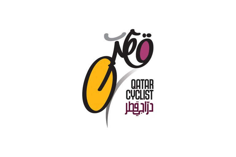
Qatar Cyclists Center is a non-profit organization promoting cycling across Qatar. In 2012, Everythink Design Studio developed their brand identity, built around a typographic idea that fused language, sport, and national pride into a single mark.
The Challenge
A cycling non-profit lives or dies on community — and community needs a flag to rally around. Qatar Cyclists needed an identity that could speak to two things at once: the sport itself, with its energy and motion, and the Qatari identity at the heart of the organization. The mark had to be simple enough to work everywhere — jerseys, websites, social media, print — and memorable enough to make a young organization instantly recognizable.
What We Did
The solution came from the name itself.
The logo embodies the word "Qatar" in Arabic calligraphy, shaped into a bicycle. One form, read two ways: a word and a wheel, language and movement in the same stroke. Simple, memorable, and unmistakably Qatari — a mark that conveys speed and culture without needing either explained.
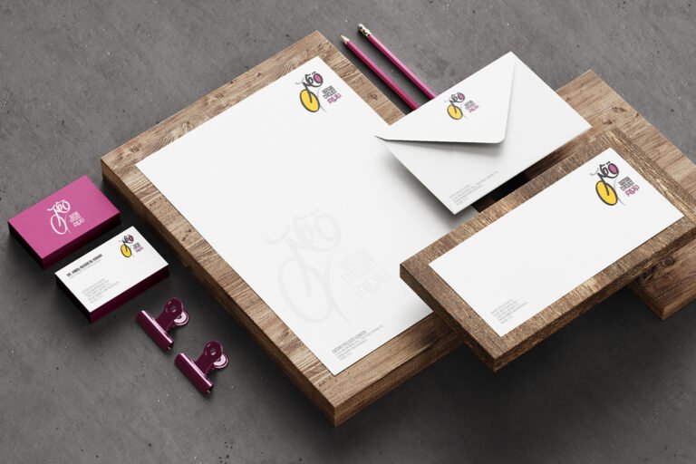
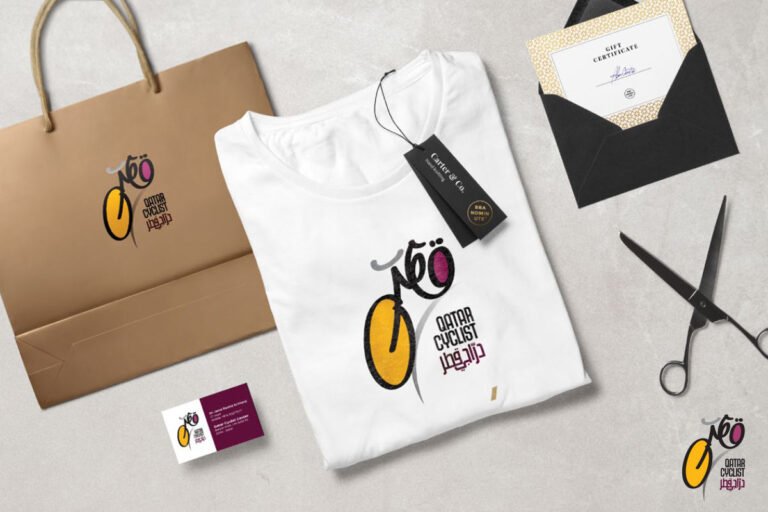
The typography is bold, modern, and custom-built — designed for effortless readability across every platform, from websites and social media to print materials.
The palette draws from the natural beauty of Qatar, grounding the identity in the landscape its riders cycle through.
Outcome
The identity was embraced by Qatar's cycling community from launch. The organization saw a significant increase in website traffic and social media engagement, and the new brand helped attract new members and sponsors — exactly what a growing non-profit needs. More than a decade later, the "Qatar-as-bicycle" mark remains a case study in what a single typographic idea can do: turn a name into a symbol, and a symbol into a community.